KRK app UX and UI redesign

A modern digital equivalent to a classic hero, reborn

Rebirth of a HERO

Not Goliath, but David came knocking on the door. A powerful classic, re-imagined as it was, refreshed but back to the roots. Bringing back the old producer fan-base.

The old APP: something seems off

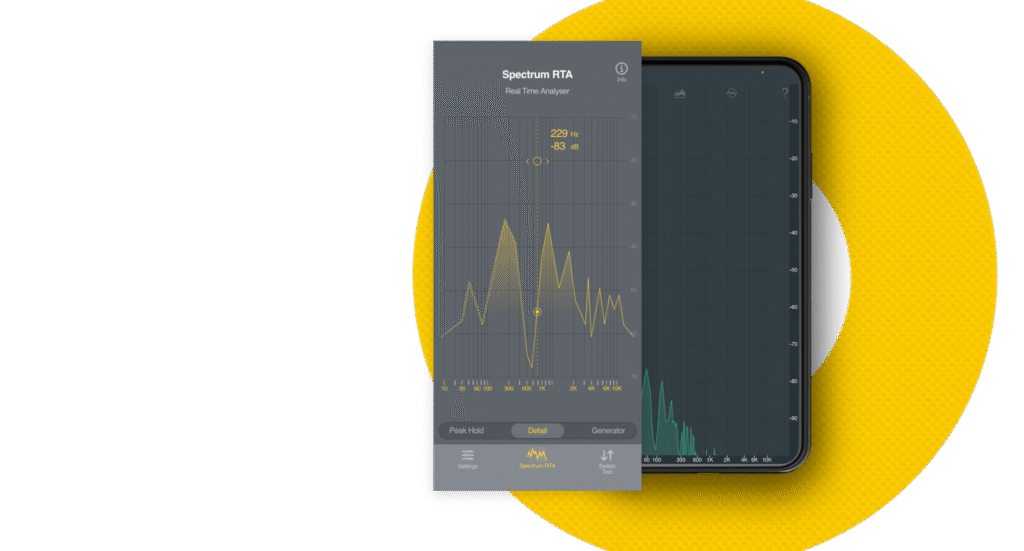
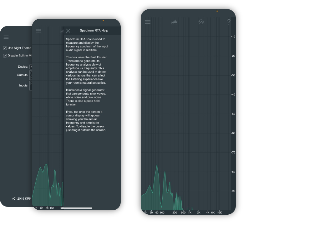
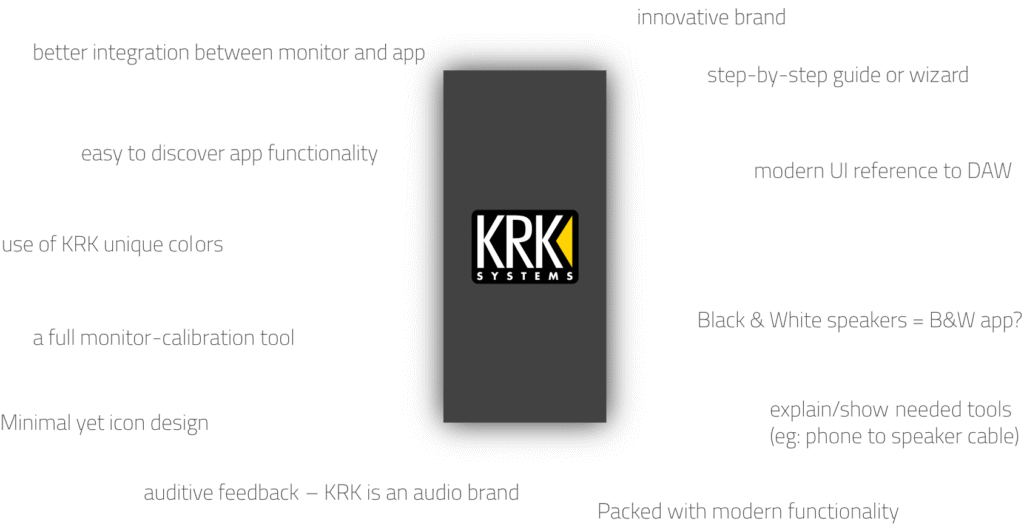
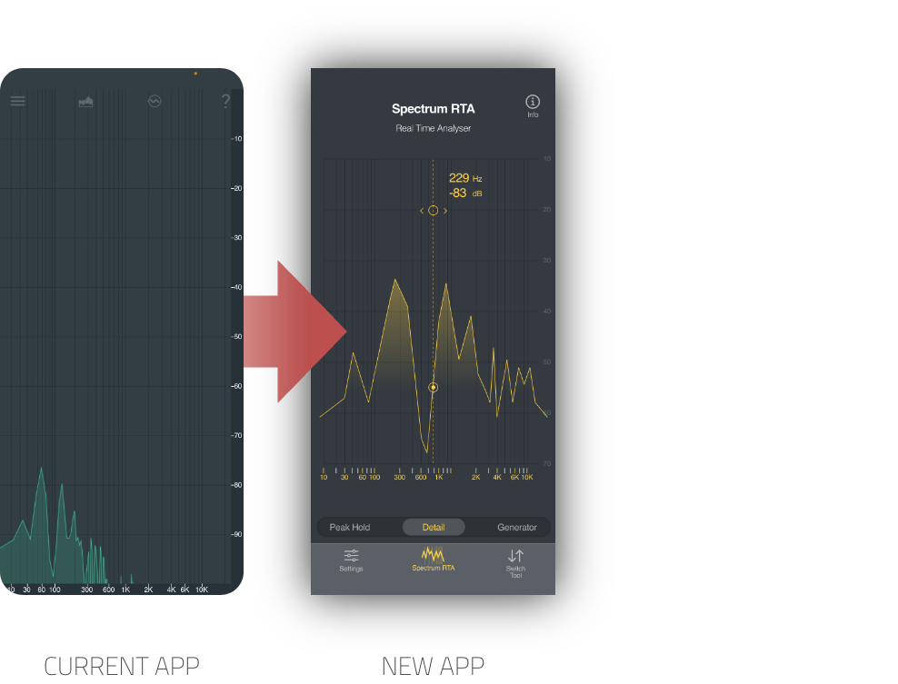
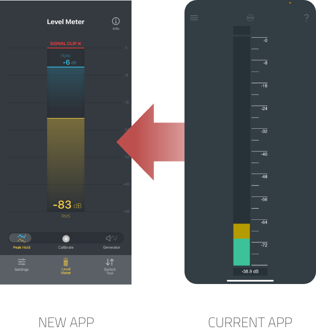
– Use of strange non KRK brand colors
– Very much relying on text
– ”easy to use” but difficult to understand
– Difficult to discover functionality

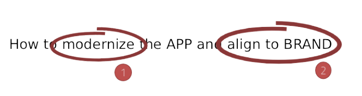
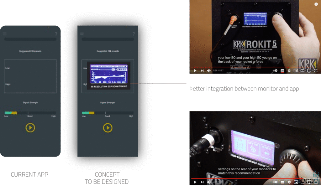
So many great tools in your hand, but so difficult to enjoy them. The app should be self-explanatory, easy to use and discoverable.

The refreshed APP: back on brand!

– KRK brand colors are back
– Visually pleasing and informing
– ”easy to use” AND easy to understand
– Discoverability hand in hand with usability

Better discoverablity and usability, rather than relying on informative text, all the info and tools right where you need them.

The refreshed APP: better UX through direct functionality

– Show what matters
– Show when it matters
– discoverability and usability improvements
– Optimised iOS grip

For the iOS platform, especially with all-screen phones, a better navigation following platform conventions was designed.

Further holistic APP + product UX improvements based on physical product attributes.